
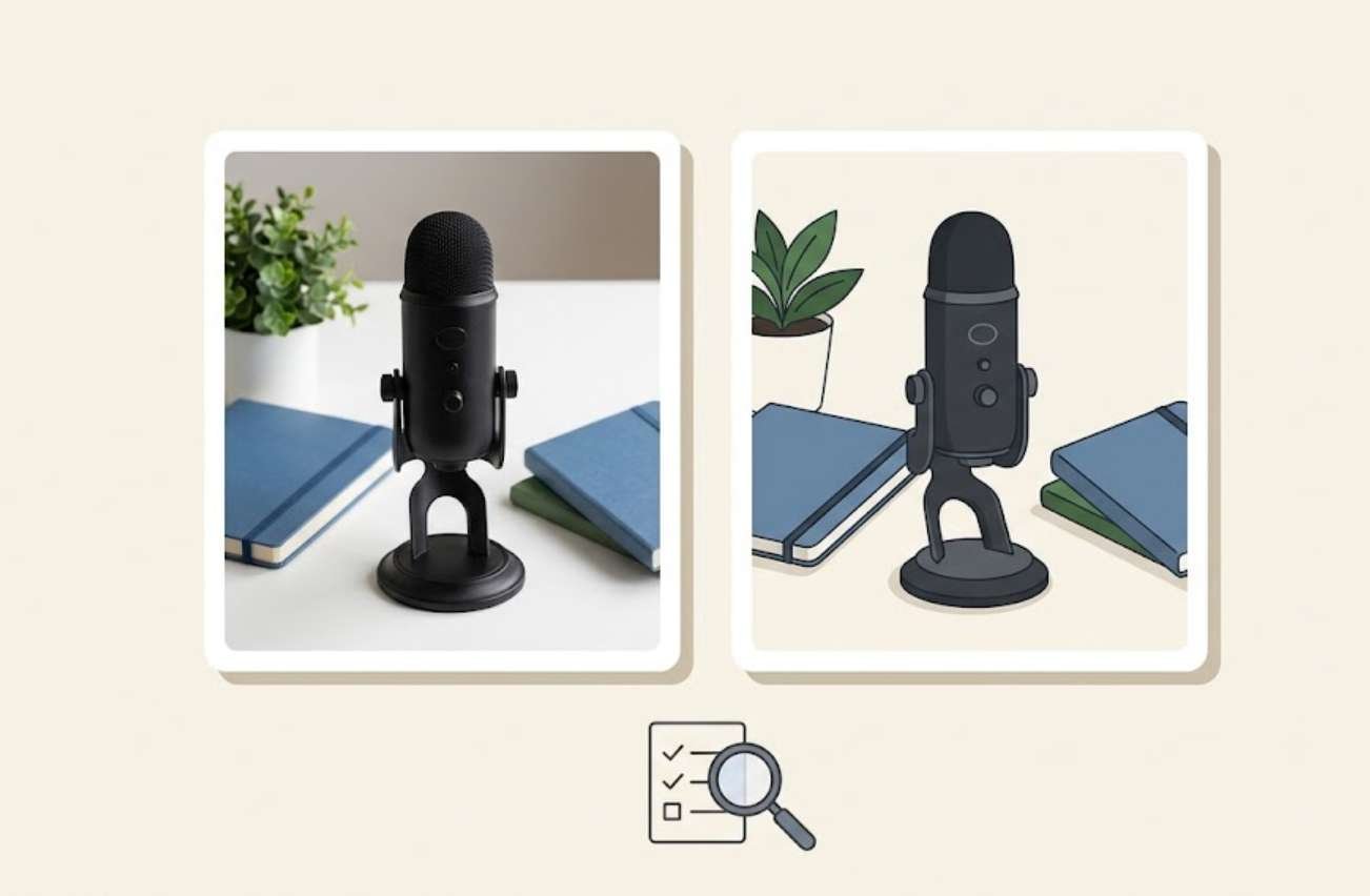
An AI image generator can produce an impressive picture and still be frustrating to use for a blog.
The photograph might look convincing, but the subject sits exactly where your headline needs to go. An illustration might have attractive colors, but its arrangement fails to explain the idea. A small editing request might fix one detail while changing several others you wanted to keep.
These problems matter because publishing involves more than generating a good-looking image. You need a result that fits the article, works within your website’s layout, and can be revised without starting over.
A useful comparison should therefore resemble your actual work.
This guide provides three practical tests: a featured image, an explanatory illustration, and a controlled edit. You can use them to compare two tools you already have access to before deciding whether either deserves a place in your publishing routine.
The prompts and scoring system below are a suggested editorial method, not an industry benchmark. No product rankings or measured test results are claimed.
1. Decide what an acceptable image must do
Before opening either tool, write down the requirements for the image you want to publish.
For a featured image, those requirements might include a wide composition, a clearly visible subject, and enough open space for a headline. For an illustration inside an article, the priority might be a simple visual relationship that remains understandable on a phone.
Use a short brief like this:
| Requirement | Example for a blog |
|---|---|
| Purpose | Featured image for an article about planning a podcast |
| Shape | Wide landscape composition |
| Main subject | A microphone beside a notebook |
| Visual style | Natural editorial photography |
| Layout | Objects on the right, open space on the left |
| Restrictions | No text, logos, or unnecessary objects |
| Final use | Article header and a smaller category card |
Separate essential requirements from preferences.
A missing microphone is a failure to follow the brief. A slightly warmer background may simply be a stylistic difference. Keeping those categories separate prevents an attractive image from receiving a high score despite being unsuitable for the article.
Choose requirements you will actually use. Testing complex fantasy scenes tells you little about a tool’s suitability for a website that mainly needs clean instructional illustrations.
2. Keep the comparison fair enough to be useful
Choose two tools and identify the model or generation mode selected in each. Record the date, image dimensions, quality setting, and any automatic prompt enhancement.
The product name alone may not describe the setup accurately. A service can offer several models or modes with different capabilities.
Begin with the same creative brief and prompt in both tools. Set the aspect ratio through the interface when that control is available. Do not assume a written request automatically overrides an application’s settings.
For the first two tests, request two initial candidates from each tool. Then allow one targeted revision to the stronger candidate. If a service generates several images at once, decide in advance which outputs count toward your comparison and record the resources used by the whole request.
Keep all the counted results, including failures.
If you compare one tool’s first attempt with another tool’s best result after twelve revisions, you are measuring different amounts of effort.
Identical settings are not always possible. When a feature cannot be matched, record the difference. You are comparing two usable publishing workflows, so differences in their controls are part of the evaluation.
3. Test one: a featured image with a specific layout
A featured image is a useful first test because it combines appearance with practical constraints.
Use this prompt:
Wide editorial photograph for a blog article about planning a podcast episode. A compact black microphone and a closed blue notebook sit on the right side of a light wooden table. A small green plant is visible near the back-right edge. The left forty percent of the composition is uncluttered pale wall and table, with room for a headline to be added later. Soft daylight from a nearby window, realistic materials, ordinary indoor setting, natural shadows. Landscape 16:9 composition. No people, visible writing, logos, watermarks, or additional equipment.
The details serve specific purposes. The microphone and notebook communicate the topic. Their placement tests whether the tool follows a layout instruction. The empty area tests whether the image will be convenient to use in a real article header.
Adobe’s guidance on writing effective image prompts recommends direct, descriptive language. That supports a concrete brief, although no prompt structure guarantees the desired result.
Evaluate each candidate at two sizes: large enough to inspect details and small enough to resemble a category card.
Ask:
- Are the requested objects present?
- Is the microphone’s shape plausible?
- Is the notebook recognizably blue?
- Does the left side remain open?
- Does the image still communicate the subject when reduced?
- Would the website’s usual crop remove an important object?
If the strongest candidate has one clear problem, make one focused revision:
Keep the scene, objects, colors, and lighting. Move the microphone and notebook farther to the right so the left forty percent remains uncluttered. Do not add anything.
Record whether the revision solves the problem and whether it introduces new ones.
4. Test two: an illustration that explains a relationship
An illustration inside an article has a different job. It needs to help readers understand something.
For this test, use a simple content-planning concept: collecting ideas, choosing a topic, and preparing a finished article.
Try this prompt:
Flat editorial illustration explaining a three-stage content-planning workflow. Arrange three distinct groups from left to right: several loose blank note cards representing collected ideas, one selected card inside a simple folder representing a chosen topic, and a neatly arranged article page with a small image area and abstract horizontal lines representing a finished draft. Connect the groups with two clear arrows pointing from left to right. Warm off-white background, charcoal outlines, muted blue and green accents, consistent line thickness, generous spacing. Wide landscape composition. No readable words, letters, numbers, logos, decorative machinery, or extra stages.
The horizontal lines represent the appearance of text. They are not meant to contain readable instructions.
Check the meaning before judging the style. Are there three groups? Do the arrows connect them in the intended order? Is the selected topic visually distinct from the collected ideas? Does decoration compete with the explanation?
A beautiful illustration that communicates the wrong relationship is not ready to publish.
If you need exact labels, add them afterward in a design editor. This keeps wording editable and lets you control the type size consistently.
Some tools also support references for composition. For example, Adobe documents a composition reference feature that guides the arrangement and structure of an image.
If you use a reference in the comparison, give both tools the same reference where supported. Otherwise, identify the reference-assisted result separately rather than mixing it with the initial text-only comparison.
5. Test three: change one detail while preserving the rest
The editing test should answer a practical question: can you correct a nearly finished image without losing the parts that already work?
Use the same source image for both tools, provided both accept image input. An image you own or are permitted to reuse is suitable. To avoid favoring either generator’s original result, you can use a separate photograph of a blue notebook on a table.
Submit this instruction:
Change only the blue notebook cover to muted forest green. Preserve the notebook’s size, position, shape, texture, and existing shadows. Keep every other object, the camera angle, lighting, background, and overall composition unchanged. Do not add text or new objects.
Inspect the edited result beside the original.
Start with the requested change. Then examine the parts that should have remained stable:
- Did the notebook move?
- Did its corners, binding, or thickness change?
- Did nearby shadows shift?
- Did background objects disappear?
- Did the framing become tighter?
- Did the image’s overall color balance change?
Google’s Gemini image-generation API documentation describes image-and-text editing for adding, removing, and modifying elements. However, features exposed in a particular app may differ from its API, so check the controls available in the product you are testing.
If the tool offers a selection or masking control, repeat the edit with the notebook selected and record that assistance. This is useful information: a tool that requires a quick selection may still fit your workflow well.
Allow up to two editing attempts. Record both outcomes rather than quietly discarding the first.
6. Score usefulness before visual appeal
You do not need an elaborate scoring system. A small, consistent checklist makes the differences easier to see.
For each task, score five criteria from zero to two:
| Criterion | 0 points | 1 point | 2 points |
|---|---|---|---|
| Brief accuracy | Misses an essential instruction | Mostly follows the brief | Meets the important requirements |
| Visual integrity | Distracting defects | Minor issues remain | No distracting defects at the intended size |
| Layout suitability | Does not fit the placement | Needs a manageable adjustment | Fits the intended placement |
| Revision behavior | Requested changes fail or disrupt the image | Partly successful | Requested change succeeds with acceptable preservation |
| Publication readiness | Requires substantial repair | Needs a small finishing step | Ready after routine export preparation |
For the revision criterion, use the permitted revision in the first two tasks and the controlled edit in the third.
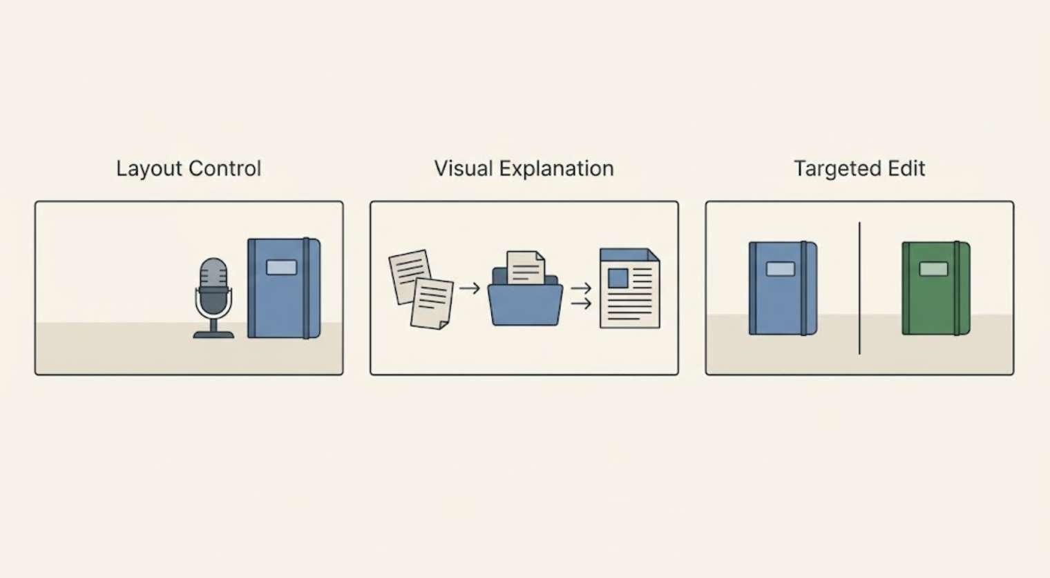
If a revision was unnecessary and you did not test it, mark that criterion “not tested.” Compare averages over the evaluated criteria rather than treating a missing test as a success.
Also record essential failures separately. A high total should not override an incorrect workflow diagram or a missing central subject.
If possible, hide the product names while reviewing the images. Label the files A and B. This can help you focus on the outputs rather than your expectations of the brands.
7. Count the work between generation and publication
A tool’s output may look good while still taking too much effort to use regularly.
Record the time spent on each task:
- Preparing or adjusting the prompt.
- Waiting for generation.
- Reviewing candidates.
- Requesting revisions.
- Repairing the image in another editor.
- Cropping and exporting the final asset.
Separate active work from waiting time. A slow generation that runs while you write may be less inconvenient than a fast generator requiring repeated corrections.
Track usage costs in the units the service actually reports. Credits from different providers are not directly comparable.
Adobe’s generative credits overview explains that included allocations depend on the plan and consumption depends on the feature. Check the current terms of your own plan rather than assuming every generation costs the same amount.
You can compare effort using:
Active minutes per completed task = total active working time ÷ completed tasks
For illustration, 24 active minutes across three completed tasks equals eight minutes per task. That is an arithmetic example, not a measured result for any product.
If a task never reaches an acceptable result, mark it unfinished. Do not let failed work disappear from your notes.
8. Check whether the images belong on the same website
A tool may pass individual tasks while producing images that look unrelated when placed together.
Put the selected featured image and illustration into a draft article or a simple page mockup. Look at them alongside your existing content.
Photographs and flat illustrations do not have to look identical. However, their color choices, visual density, and overall tone should feel intentional.
Write a short style note you can reuse:
Calm editorial visuals for a practical technology blog. Restrained blue and green accents, uncluttered compositions, clear subjects, natural-looking materials in photographs, and simple shapes in illustrations. Avoid unnecessary decorative elements.
Some products provide a dedicated style reference control. Adobe describes style references as a way to guide the look and feel of generated images.
Treat a reference as guidance and inspect the output. It does not remove the need to check composition or accuracy.
Save your style note with a few approved examples. That gives you a useful starting point for later articles without copying the same scene repeatedly.
9. Verify the downloaded file
Review the exported image, not just the preview inside the generator.
Open the download and check its pixel dimensions, crop, visible detail, and any transparency your layout needs. Place it at the intended width in a draft post.
An image that looks impressive when displayed large may become confusing in a small card. Thin lines can become difficult to distinguish, while important objects close to the edges can disappear when your theme crops the image.
Also check how much preparation is needed before upload. If every result requires extensive resizing, background cleanup, or reconstruction, include that work in the comparison.
For a blog, the acceptance question is practical: does this image help the reader in the place where it will actually appear?
Use generated images as illustrations. When an article needs evidence of a software setting, a measured result, or a real event, use the relevant genuine screenshot, chart, or photograph. An attractive invented dashboard cannot document a test.
10. Make a decision based on recurring tasks
Review the results by task before calculating any overall preference.
One tool may be stronger at featured photographs and another at preserving details during edits. That does not automatically mean you need two subscriptions.
Consider how often each task occurs.
If you publish four articles per month and mostly need simple cover illustrations, repeated failures on complex text-heavy posters may not matter to your work. If your articles rely on consistent diagrams, illustration accuracy may deserve more weight than photographic realism.
Use these questions to make the decision:
- Which tool completes my most common task reliably?
- Which produces the fewest essential failures?
- Which lets me fix problems with the least active effort?
- Can I get suitable files within the plan I intend to use?
- Do the results fit my website after ordinary finishing work?
If neither tool completes an important task reliably, adjust the workflow. You might generate the visual elements and assemble an exact diagram manually, or use a real photograph for an article that requires a specific physical setup.
There is no need to force every visual task through the same generator.
11. Keep a short record for the next comparison
Save the prompts, source image for the editing test, selected outputs, and unsuccessful attempts in one folder.
Add a note containing:
- Test date.
- Product and selected model or mode.
- Relevant settings.
- Number of attempts.
- Important successes and failures.
- Active time and usage consumed.
- Tasks for which you would use the tool again.
A useful final note is specific:
Suitable for uncluttered editorial illustrations. Featured photographs need careful crop checks. Small object edits sometimes change nearby details, so allow time for comparison with the original.
This tells you more than “excellent image quality.”
Repeat the affected task when you change models, encounter a recurring failure, or gain access to a feature that could solve a real publishing problem. Keeping the original briefs gives you a consistent way to judge whether the new setup improves your work.