
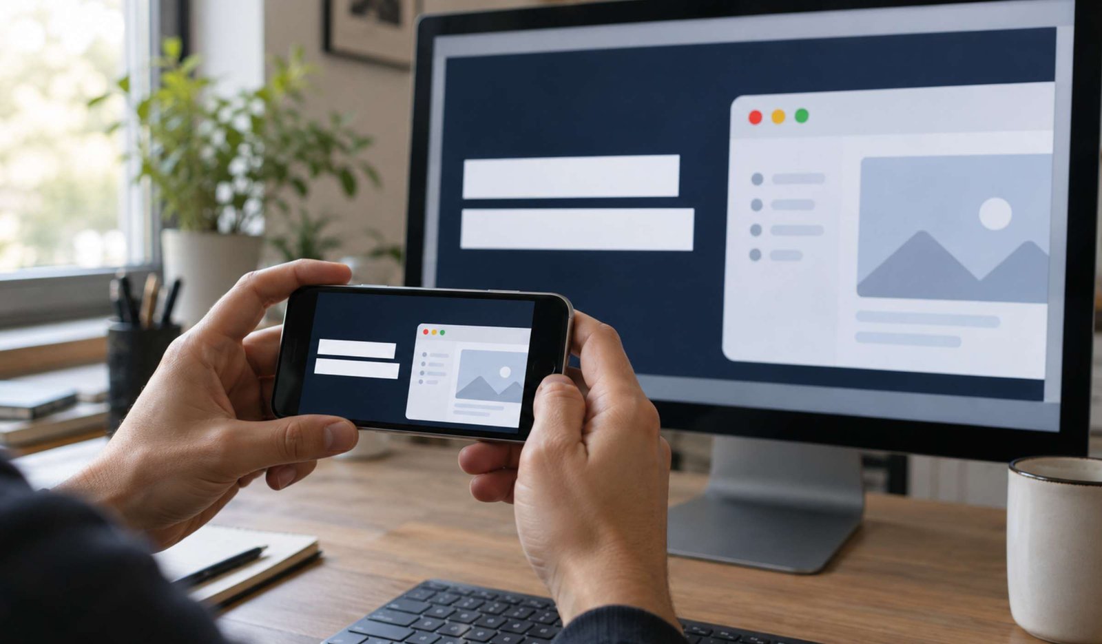
A screenshot can be perfectly readable inside your video and almost impossible to understand as a thumbnail.
When the entire desktop is squeezed into a small preview, menus become tiny lines, the cursor disappears, and the viewer cannot tell what the tutorial will help them do.
A useful tutorial thumbnail makes the subject and purpose recognizable before someone starts watching.
This guide walks through a practical example: a video about recording a readable screen tutorial in OBS Studio. You can adapt the same process to WordPress lessons, editing demonstrations, and other instructional videos.
The design examples are illustrative. They are not results from a thumbnail performance experiment.
1. Define the Promise Before Opening Your Design Tool
Write one sentence describing the result your video actually teaches.
For our example:
This video shows beginners how to make text easier to read in an OBS screen recording.
That sentence gives the thumbnail a direction. It does not need to communicate every setting covered in the video.
Now list the details that matter:
- The video concerns screen recording.
- OBS Studio is the tool.
- Readable text is the practical goal.
Details such as the recording folder, microphone setup, and export workflow may belong in the video, but they do not all need space on its thumbnail.
A short design brief could look like this:
| Element | Decision |
|---|---|
| Viewer | A beginner recording software tutorials |
| Problem | Text is difficult to read in the recording |
| Main image | A focused crop from the actual demonstration |
| Thumbnail wording | “READABLE TEXT” |
| Video title | “How to Record a Readable Screen Tutorial in OBS Studio” |
YouTube recommends accurate titles and thumbnails that help viewers understand the content. Its thumbnail and title guidance also emphasizes readable text and avoiding overly complex designs.
2. Choose an Image That Shows the Subject
Review your finished video and identify a frame that supports the promise.
For a software tutorial, useful candidates include:
- The relevant part of an application.
- A finished result created during the demonstration.
- A close view of the control the video explains.
- A comparison that genuinely appears in the video.
For our OBS example, choose a frame in which the recorded application is easy to recognize. Crop around the relevant content instead of showing the entire desktop.
Avoid using a screen full of settings simply because it looks technical. At thumbnail size, that screen may communicate less than one clearly visible interface element.
Ask three questions:
- Can someone recognize the subject without reading the title?
- Is the important part large enough to notice?
- Does the image represent something the video actually shows?
If the answer to the third question is no, select another image.
Be careful with before-and-after comparisons
A comparison can be useful when the video demonstrates a real difference. However, the two sides should be presented fairly.
If you compare text readability, use equivalent content and comparable display sizes. Do not make the “before” version artificially worse just to strengthen the thumbnail.
If you have no genuine comparison, use a single clear result or demonstration frame.
3. Set Up the Canvas and Export Format
This guide focuses on standard horizontal videos.
As checked in October 2026, YouTube recommends a 3840 × 2160 thumbnail with a 16:9 aspect ratio. Its guidance lists JPG and PNG as suitable formats. Upload limits depend on the device: 50 MB on desktop and 2 MB for video thumbnails on mobile. Custom uploads require account verification. See the current YouTube thumbnail requirements.
Create the canvas in an image editor that supports custom dimensions, cropping, text, and JPG or PNG export.
Keep the editable project as well as the exported image. You may later need to change one phrase or replace a screenshot without rebuilding everything.
A large canvas does not rescue a blurry source image. If your screenshot looks soft when enlarged, capture a clearer source or use a layout that does not require stretching it so far.
When exporting, inspect the resulting file. Compression can damage small lettering and sharp interface edges even when the design looked clean in the editor.
4. Build a Layout with One Main Focus
Start with the image and the short message. Add other elements only when they improve understanding.
For our example, try this arrangement:
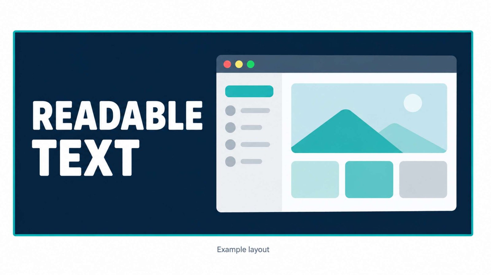
- Place the cropped demonstration image on the right.
- Put “READABLE TEXT” on the left.
- Use a plain background behind the words.
- Leave space around both elements.
As a design exercise, let the image occupy roughly three-fifths of the width and the text area occupy the rest. This is a starting layout, not a YouTube requirement.
Keep the main subject away from the edges. Leave the lower-right corner relatively quiet so it remains usable when interface elements appear over that area.
Now remove anything that competes with the message:
- Extra screenshots.
- A second headline.
- Several arrows pointing in different directions.
- Small feature lists.
- Decorative badges with no clear purpose.
An arrow is useful when it points to something viewers would otherwise miss. If the subject is already obvious, the arrow may add clutter.
Likewise, a face is optional. Use a person when their expression or action helps explain the video. A screen tutorial can work visually with the software or result as its main subject.
5. Write Thumbnail Text That Complements the Title
The title can explain the topic precisely. The thumbnail can emphasize the problem, result, or key object.
For the example video:
Title:
How to Record a Readable Screen Tutorial in OBS Studio
Thumbnail text:
READABLE TEXT
Together, they communicate the software, task, and desired outcome.
Putting the entire title inside the image would require smaller text and repeat information the viewer already receives beneath it.
Try a few short alternatives:
| Thumbnail wording | When it fits |
|---|---|
| READABLE TEXT | The video demonstrates how to improve text readability |
| RECORD YOUR SCREEN | The video is a general beginner recording guide |
| FIX BLURRY TEXT | The video specifically diagnoses and addresses blurry text |
| BEFORE YOU RECORD | The video focuses on preparation checks |
Choose wording that matches the actual lesson.
“FIX BLURRY TEXT” would be too broad if the video only demonstrates enlarging a browser window and does not address other sources of blur.
As an editing exercise, begin with two to five words. This is not a platform rule; it forces you to identify what deserves the space.
Read the title and thumbnail wording together. Remove unsupported promises such as “perfect results,” “guaranteed quality,” or “one setting fixes everything.”
6. Check the Design at Small Sizes
Do not approve the thumbnail while viewing it full-screen in your editor.
Make a small preview approximately 320 × 180 pixels. You can also inspect a smaller version, such as 160 × 90, to see which details disappear. These are practical preview sizes, not official upload dimensions.
At each size, check:
- Is the main object still recognizable?
- Can you read the words without leaning closer?
- Does the background interfere with the letters?
- Is there a clear first thing to notice?
If the design fails, enlarge or simplify the important elements. Adding a thicker outline to every object is not always the answer.
For example, if the application crop becomes an unreadable rectangle, crop more tightly. If the headline becomes a block of tiny letters, shorten it.
Test it on a phone
Open the exported image on your phone at a realistic preview size. Do not pinch to zoom during the first check.
If possible, ask someone unfamiliar with the video:
What do you think this video will teach?
Their answer can reveal a mismatch between your intended promise and the visible design.
This is a comprehension check. It does not predict click-through rate or prove that the design will outperform another thumbnail.
7. Make Two Meaningful Variants
Once the first design is clear, create a second version with a specific difference.
For example:
| Version | Main image | Wording | What changes |
|---|---|---|---|
| A | Tight crop of the readable recording | READABLE TEXT | Shows the result |
| B | Wider view showing the recording setup | READABLE TEXT | Shows more context |
Keep the title and wording unchanged if you want to focus on the visual choice.
You could instead compare two messages while keeping the image consistent. The important point is to know what question you are exploring.
Avoid producing several versions that differ only in tiny decorative details before you have solved the basic communication problem.
Name the files clearly:
obs-readable-text-result.jpgobs-readable-text-context.jpg
Keep a note explaining the difference. That note will be more useful later than trying to remember why “final-version-7” exists.
8. Upload the Thumbnail and Review Its Placement
In YouTube Studio:
- Open Content.
- Select the video.
- Find Thumbnail.
- Choose Upload file.
- Select your exported image and save.
YouTube notes that thumbnail changes may take time to appear. These steps are documented in its custom thumbnail instructions.
Review the saved image alongside the title. Check for unintended cropping, a spelling mistake, or a mismatch with the video.
Also compare the promise with the opening of the video. If the thumbnail emphasizes readable screen text, viewers should quickly understand that this is the problem you will address.
A clear thumbnail cannot compensate for an introduction that sends the lesson in a different direction.
9. Evaluate Performance Without Misreading CTR
YouTube’s impressions click-through rate measures how often viewers watched after a registered thumbnail impression.
It does not use every view your video receives. For example, some views from external sources are outside that calculation. YouTube also explains that CTR varies with audience and where the impression appears. See its impressions and CTR FAQ.
Consider this hypothetical situation:
- An early audience familiar with your channel produces a higher CTR.
- Later, YouTube shows the video to a broader audience and CTR falls.
That change alone does not prove that the thumbnail became worse.
Similarly, replacing a thumbnail on Tuesday and seeing more views on Wednesday does not isolate the thumbnail’s effect. Traffic sources, audience composition, and other factors may have changed.
Use the video-level Reach tab to review impressions and their connection to views and watch time. YouTube describes these reports in its thumbnail impressions and watch-time guide.
Avoid setting one universal “good CTR” target for every video. Compare results in context and give the video enough exposure before drawing conclusions.
10. Use Built-In Testing When Eligible
YouTube offers A/B testing for up to three titles, thumbnails, or combinations. The feature is available through desktop Studio and requires advanced features, with additional video eligibility restrictions.
Its results use watch time share rather than simply selecting the highest CTR. A test can also finish without a clear winner. See YouTube’s current A/B testing documentation.
If you are investigating thumbnail design, keep the title fixed and test the relevant image variants where the interface allows.
Treat the outcome as evidence about those options for that video and audience. A winning layout does not establish a rule for every future upload.
If testing is unavailable or inconclusive, choose the version that most clearly represents the lesson. Keep the files and your reasoning so you can learn from later videos.
Before publishing, confirm that the thumbnail shows the real subject, its words remain readable at small sizes, and its promise matches the lesson. The viewer should be able to recognize what they will learn without decoding a crowded image.