
Posting a screenshot of your latest article tells people that you published something. It does not necessarily tell them why they should read it.
A useful Instagram Story gives readers a clearer reason to visit: it identifies a problem, shares something helpful, and explains what the full article adds.
The link then connects that promise to the right page.
This guide walks through a simple three-frame Story sequence, shows how to add a working link sticker, and explains how to check the experience from a reader’s perspective.
Start With One Reader Problem
Choose one question your article answers.
For example, imagine you have published a guide to recording clearer voice audio for YouTube. The article covers room noise, microphone placement, recording levels, and checking a sample before recording the full script.
Your Story does not need to summarize all those sections.
A useful starting question is:
“Does your voice recording sound distant or echoey?”
That gives the viewer a recognizable problem. You can then share one practical action and link to the complete recording workflow.
Compare these two opening lines:
| Opening | What it tells the viewer |
|---|---|
| “New article on the blog!” | Something was published |
| “Before recording your next tutorial, listen to a short microphone test.” | There is a useful action to consider |
The second opening introduces the article through the reader’s task.
Write down the problem and the destination before designing anything. This keeps the Story focused.
Step 1: Check the Article on Your Phone
Open the published article on a phone before creating the promotion.
Use the public page, not a WordPress editing or preview link.
Check that:
- The headline matches the topic you plan to introduce.
- The opening paragraphs explain what the reader will learn.
- Images and tables fit the screen.
- Text is comfortable to read.
- Menus and overlays do not prevent access to the article.
- The advice mentioned in the Story is easy to find.
For the audio example, someone arriving after a microphone-placement tip should quickly recognize that the page discusses voice recording.
Link directly to the relevant article. Sending someone to your homepage introduces another search step after you have already promised a specific guide.
If the page is unfinished or difficult to use on mobile, fix that before promoting it.
Step 2: Plan a Three-Frame Sequence
Three frames provide a manageable starting structure:
- Introduce the problem.
- Give one useful action.
- Explain what the full guide adds and provide the link.
This is an editorial suggestion, not a required format or a claim about Instagram’s ranking system. A simple announcement may need only one frame, while a demonstration may need more.
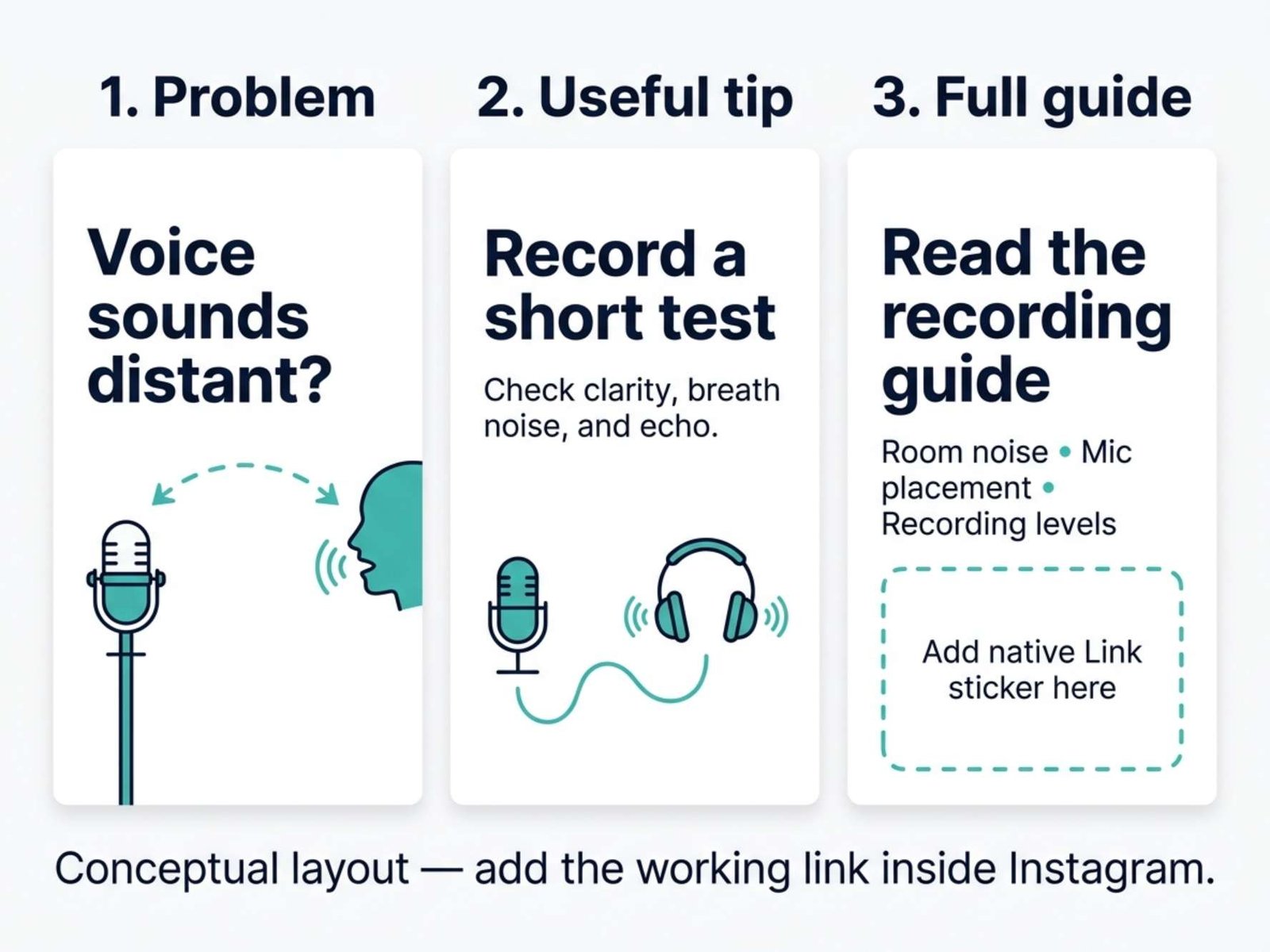
Here is a complete example for the voice-recording article.
Frame 1: Identify the Problem
Main text:
Does your tutorial voice sound distant or echoey?
Supporting text:
Check your recording setup before adding more effects.
Visual idea:
A real photograph of a microphone positioned far from the speaker, or a clearly labeled demonstration of that setup.
Do not claim the photograph proves anything about the sound. It illustrates the situation you are describing.
Frame 2: Give a Useful Action
Main text:
Record a short test first.
Supporting text:
Try a closer microphone position. Listen for clearer speech, breath noise, and room echo.
Visual idea:
A close photograph showing the relationship between the speaker and microphone.
Keep the advice conditional. The best position depends on the microphone and the recording conditions; a single distance is not right for every setup.
Frame 3: Offer the Complete Workflow
Main text:
Want the full recording checklist?
Supporting text:
The guide covers room noise, microphone placement, recording levels, and a final listening check.
Link label or nearby instruction:
Read the voice-recording guide
Visual idea:
A simple background with enough open space for the actual Instagram link sticker.
The sequence gives viewers something useful before asking them to leave the app.
Step 3: Make Each Frame Easy to Read
Design for the phone screen where the Story will appear.
A 1080 × 1920-pixel canvas, using a 9:16 portrait layout, is a practical starting size for your artwork. Preview the result in Instagram rather than assuming that the design canvas represents every visible area of the app.
Keep essential text away from the extreme top and bottom, where interface controls may overlap it.
Use:
- One main idea per frame.
- A short, prominent headline.
- A small amount of supporting text.
- Strong contrast between text and background.
- Space around the link sticker.
If a frame needs a paragraph to explain itself, simplify the idea or move the detail into the article.
Avoid using a complete desktop screenshot as the background when its text becomes unreadable on a phone. A cropped detail or a short screen recording may communicate the same point more clearly.
For spoken video, include readable captions or an on-screen summary so the main message also works without sound. Review automatic captions for names, numbers, and missing words.
Step 4: Prepare the Link You Will Share
Copy the article’s complete public URL and open it once to confirm the destination.
If you already use Google Analytics, you can add campaign parameters to distinguish this promotion from other visits.
For the example sequence, a consistent set might be:
| Parameter | Example value |
|---|---|
utm_source |
instagram |
utm_medium |
social |
utm_campaign |
voice_audio_guide |
utm_content |
story_microphone_test |
Use your actual article URL with these values in Google’s Campaign URL Builder. Keep your existing naming convention if you already have one.
The parameters describe the promotion; they do not change the article itself. Google explains their use in its campaign URL documentation.
Open the completed link and confirm that it still reaches the correct page.
You can publish a working Story link without analytics. Tracking is useful for evaluation, but it is not a prerequisite for sharing the article.
Step 5: Add the Actual Link Sticker
Upload or capture the image or video for your link frame in Instagram’s Story composer.
Then:
- Open the sticker tray.
- Choose Link.
- Paste the complete article URL, including any tracking parameters.
- Confirm with Done.
- Position the sticker where it is easy to see and tap.
Meta describes this basic workflow in its official link-sticker announcement (Japanese). Button placement and available styling controls may vary by app version.
If your interface offers custom sticker text, use a clear description such as “Read the recording guide.” Otherwise, place a short explanation beside the sticker.
A button drawn into your image is only part of the picture. It does not become a working website link.
Add the native Instagram sticker after importing your design, and keep it visible instead of covering it with decorative elements.
Step 6: Make the Link Frame Understandable on Its Own
Some viewers may reach the final frame without reading every earlier one.
The link frame should therefore identify both the topic and the destination.
This is too vague:
“Here it is!”
This provides enough context:
“Read the full guide to recording clearer voice audio for YouTube.”
You do not need to repeat the entire introduction. Just include enough information for someone to understand what happens when they tap.
Also keep the promise accurate. If the article contains written instructions, do not label the link “Download the checklist” unless a downloadable checklist actually exists.
Use one clear next action. Asking people to visit the site, answer a poll, send a message, and follow another account on the same frame makes the purpose harder to understand.
Step 7: Review and Test the Published Story
Before publishing, check the frame order, spelling, link destination, and intended audience.
After publishing, open the Story and follow the link. Where possible, check it from another account that is allowed to view the Story.
Test the full path:
Story → link sticker → article → promised information
Confirm that the article opens correctly inside Instagram’s browser as well as in your usual mobile browser.
Look for practical problems:
- The link points to an older article.
- A redirect leads to the homepage.
- The page loads but an overlay blocks the content.
- The heading promises something different from the Story.
- The link sticker sits too close to another control.
If you discover a wrong destination, correct the promotion promptly. When the published Story does not offer a way to change the link, remove the incorrect frame and publish a corrected version.
What If the Link Sticker Is Missing?
Check the sticker tray in the mobile app and make sure Instagram is updated.
Feature availability can depend on the account. Meta’s announcement notes restrictions for newly created accounts and accounts that repeatedly violate its rules, so access should not be assumed for every account at every moment.
Avoid repeatedly redesigning the image to solve a missing interactive feature. A graphic that resembles a link sticker still will not create a working link.
As a fallback, use an available website-link field on your profile and give viewers a specific instruction for finding the article there. Test that route too, especially if your profile contains several destinations.
Step 8: Review Visits Separately From Story Activity
Story activity and website activity answer different questions.
If your account provides Story insights, record the available viewing and link-interaction metrics using the labels shown in your app. A Story view does not prove that someone visited or read the article.
In GA4, use the Traffic acquisition report and examine Session source / medium and Session campaign for your tagged promotion. Google documents these campaign-reporting dimensions in its URL-builder guide.
Do not expect website sessions to match link taps exactly. Someone can tap more than once, leave before the page finishes loading, or browse without analytics being recorded.
Keep a small record of each promotion:
| Record | Example |
|---|---|
| Article | Voice-recording guide |
| Opening angle | Distant or echoey speech |
| Useful tip | Make a short microphone test |
| Link instruction | Read the recording guide |
| Website campaign | voice_audio_guide |
| Next change to try | Make the opening sentence shorter |
The example is a planning record, not a claim about measured results.
Improve One Part at a Time
For a later promotion, keep the article and destination the same while changing one aspect of the Story.
You might try:
- A clearer opening question.
- A closer crop of the demonstration.
- Less text on the tip frame.
- A more specific explanation beside the link.
Compare results over similar observation periods and record what changed. Different audiences, timing, and surrounding content can affect performance, so one comparison is not proof that a design caused the difference.
Questions and replies can also reveal useful gaps. If several people ask what microphone position you mean, the visual or explanation may need improvement.
Before You Share
Make sure the Story answers one recognizable question, offers a useful detail, and links to a page that fulfills its promise.
Check the native sticker, the mobile reading experience, and the destination after publishing.
A good Story introduces the article in a way that helps people decide whether it is relevant to them. The full guide then delivers the detail they chose to read.