
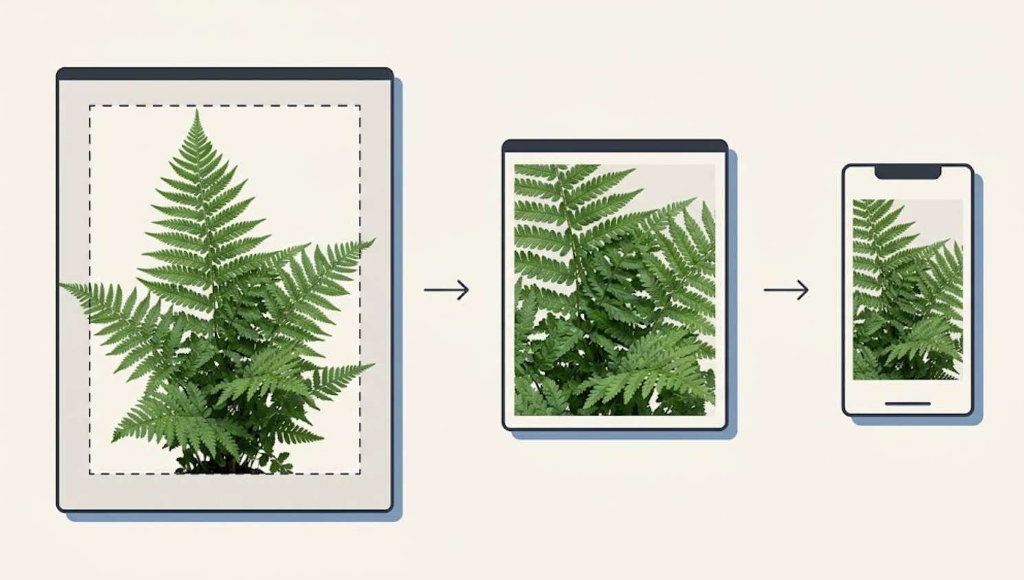
A photograph can look perfect in your WordPress editor and still be the wrong file for your website. It may contain far more pixels than the page needs, arrive too late to help the first screen load, or lose important details after aggressive compression.
Screenshots introduce a different problem. Reducing their file size is useful only while readers can still identify the buttons, labels, and settings the article explains.
Good image optimization means making several decisions together: what the image needs to show, how large it will appear, which format preserves the relevant details, and when the browser should download it.
This guide walks through that process for a typical WordPress blog. Start with one published article, keep copies of your original images, and work through the changes before applying them across your media library.
1. Establish what needs fixing before changing files
Choose a representative article containing a featured image and several images within the text. Testing only your homepage can miss problems that appear in individual posts.
Run the article through PageSpeed Insights and save the mobile report. Look for image-related findings and identify the page’s Largest Contentful Paint element, which may be a prominent image or a text block.
PageSpeed Insights combines two different kinds of information. Its laboratory test examines a simulated page load, while available field data describes real visitors’ experiences over a rolling 28-day period. A newer or lightly visited page may not have enough field data. That absence alone does not establish a performance problem. Google explains the distinction in its PageSpeed Insights documentation.
Create a small record before editing:
| Item | What to record |
|---|---|
| Page being tested | The exact article URL |
| Test conditions | Mobile or desktop |
| Featured image | File name, dimensions, and format |
| Main visual problem | Slow appearance, blur, cropping, or movement |
| Performance observations | Relevant diagnostics and LCP timing |
| Reader experience | Whether screenshots remain readable on a phone |
Also open the page on your phone. A performance report cannot tell you whether a compressed settings screenshot is still useful to someone following your instructions.
2. Crop unnecessary content before reducing resolution
Cropping and resizing solve different problems.
Cropping removes parts of the image. Resizing changes the number of pixels used to represent what remains.
For a tutorial screenshot, cropping is often the better first move. A full desktop capture may include a browser toolbar, unrelated tabs, an empty sidebar, and a small settings panel. Shrinking the entire capture makes the relevant panel harder to read.
Instead, crop around the panel while keeping enough context for readers to recognize where they are. If the instruction concerns an image resolution selector, include the selected image and its settings panel. The rest of the desktop usually adds little.
For photographs, decide on the composition before exporting. If a featured image will appear in a wide rectangle, prepare that crop deliberately. Otherwise, an automatic theme crop may remove the subject or cut off important details.
Keep an untouched original. If the site layout changes later, you can produce a new crop without enlarging an already reduced copy.
A useful editorial question is: What would readers lose if I removed this part of the image? If the answer is nothing, it probably does not need to be downloaded.
3. Match image dimensions to the layout
An image’s displayed width and its file dimensions are not necessarily the same.
Suppose a photograph appears at approximately 760 CSS pixels wide in your article. A 1,520-pixel-wide version is a reasonable candidate to test for a screen with a pixel density of two. That is a starting point for this example, not a required WordPress image size.
Phones, tablets, and desktop screens need different combinations of dimensions and density. Responsive images let the browser choose among available files rather than forcing every visitor to download the same version.
The srcset attribute lists image candidates, while sizes helps describe their expected display width. Browser selection also depends on the device. Google’s responsive image guide explains how those pieces work together.
In practice:
- Measure or estimate the largest width the image actually occupies.
- Prepare enough detail for that use without automatically exporting the camera’s full resolution.
- Check the result on both a standard display and a sharper mobile screen.
- Treat small thumbnail cards separately from full article images.
A sidebar thumbnail and a full-width tutorial screenshot do not need identical export settings.
4. Choose the format according to the image
There is no reason to force every image on a website into one format.
Use the subject matter to decide which versions are worth comparing:
| Image type | Formats worth testing | Main quality check |
|---|---|---|
| Photographs | WebP, AVIF, JPEG | Fine detail, gradients, and natural textures |
| Screenshots containing small text | PNG or lossless WebP | Letter edges and interface labels |
| Flat graphics with transparency | PNG or WebP | Clean edges and transparent areas |
| Detailed illustrations | WebP, AVIF, or PNG | Thin lines, color transitions, and small features |
JPEG uses lossy compression. PNG preserves image data through lossless compression. WebP and AVIF offer both lossy and lossless possibilities, although available options vary by tool. The MDN image format guide provides a broader comparison.
WordPress introduced AVIF upload support in version 6.5, but the hosting environment must also support processing it. Before adopting AVIF across your site, check Tools → Site Health → Info → Media Handling for supported formats and test an upload. WordPress documents these requirements here.
Choose the version that works in your actual publishing setup. A theoretically efficient format is not useful if your server cannot produce the image sizes your theme needs.
5. Compress by inspecting the result

Compression settings are a means of reaching a visual result. They are not a universal quality standard.
Lossy compression discards some image information. Lossless compression preserves it. Photographs often tolerate lossy compression better than screenshots containing sharp text and colored edges. Google’s image performance guidance recommends experimenting and inspecting the result rather than relying on one setting for every file.
For a small batch of images, a comparison tool such as Squoosh can help:
- Open a copy of the original or cropped image.
- Set the intended pixel dimensions.
- Select an output format.
- Compare the original and compressed versions.
- Adjust compression and examine the important areas.
- Download the chosen version under a descriptive file name.
Inspect at normal viewing size first. Then enlarge the preview to understand any artifacts you notice.
For a photograph, examine hair, leaves, fabric, shadows, and smooth skies. For a screenshot, examine the smallest text that readers must understand.
A smaller file is not an improvement if the tutorial becomes harder to follow. If compression damages text, try a lossless format, a tighter crop, or two focused screenshots instead of one crowded image.
Always make new exports from the original source. Repeatedly editing and saving a lossy copy can compound visible damage.
6. Insert the appropriate version in WordPress
Upload the prepared image to the Media Library and insert it through an Image block.
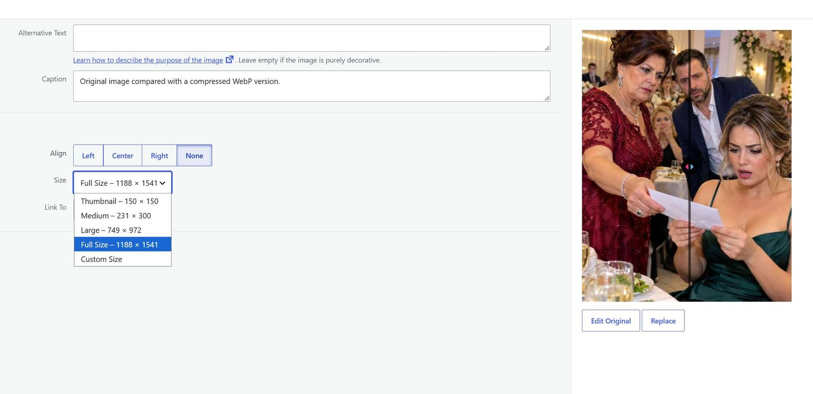
Select the image and review the block settings. Depending on the source image and site configuration, the resolution options can include Thumbnail, Medium, Large, and Full Size. Choose a suitable starting option and inspect the published result. The official Image block documentation describes these controls.
Do not confuse making an image look smaller in the editor with verifying that visitors download a smaller file. Display dimensions and download size are separate concerns.
WordPress has built-in support for generating multiple image sizes and adding responsive image information to its output. However, the actual result also depends on how the theme or page builder displays the image. The WordPress explanation of responsive images describes the underlying behavior.
After updating the article, check:
- The featured image on the article itself.
- The same image in category cards or other previews.
- Screenshots inside the post.
- Any image that opens at a larger size when clicked.
A crop that works in the article may cut off a useful detail in a category card. Preview both before considering the image finished.
7. Load the first screen promptly and defer later images
Lazy loading postpones downloading images that are not immediately needed. It is helpful for a long article with illustrations farther down the page.
The prominent image at the beginning of an article needs different treatment.
If that image is visible immediately, delaying its request can make the page feel unfinished. This matters especially when it is the Largest Contentful Paint image. Google recommends avoiding lazy loading for images in the initial viewport, particularly the LCP image. Read the browser-level lazy-loading guidance.
Check whether your theme, optimization plugin, or image service already manages lazy loading. Avoid enabling several overlapping systems without understanding their responsibilities.
Use this division as a starting point:
- Images visible immediately: allow normal loading.
- Images farther down the article: use lazy loading where appropriate.
- The measured LCP image: investigate its loading behavior specifically.
Developers can also use fetchpriority="high" to signal the importance of a critical image. This is a targeted hint, not something to apply to every picture. Google explains fetch priority here.
8. Reserve space so the article does not jump
An image can cause trouble even when its file size is modest.
Imagine reading the first paragraph when a picture loads above it and pushes the text down. The problem is that the page did not reserve the image’s space in advance.
Correct image width and height attributes allow browsers to establish an aspect ratio before the file finishes loading. The image can still scale responsively within the layout. Google’s guidance on preventing layout shifts explains this mechanism.
On your published page, watch what happens during loading. Do paragraphs move when an illustration appears? Does the featured image suddenly push the title or article body downward?
If so, inspect the theme or image block output rather than compressing the file again. Reducing bytes does not supply missing layout information.
Keep the declared aspect ratio consistent with the displayed image. A photograph cropped to a wide banner needs space reserved for that banner, not for an unrelated portrait-shaped original.
9. Apply the process to one article
Consider this hypothetical example: a WordPress tutorial contains one photograph and three screenshots. The photograph comes from a camera, and the screenshots show full desktop windows.
These are example starting conditions, not measurements from a live website.
A useful optimization plan would look like this:
| Asset | Initial concern | Change to test | Acceptance check |
|---|---|---|---|
| Featured photograph | Much larger than its display area | Crop, resize, compare formats | Subject remains sharp on desktop and mobile |
| First screenshot | Important setting occupies a small area | Crop around the relevant panel | Setting label is readable without excessive zooming |
| Second screenshot | Several unrelated steps appear together | Split into focused images | Each image explains one clear action |
| Final illustration | Appears near the end of the article | Confirm lazy loading | Image arrives when the reader approaches it |
Work on the featured photograph first. Save its original dimensions and file size, create the candidate export, and compare both at the intended display size.
Then handle the screenshots individually. Their purpose is to communicate instructions, so a slightly larger crisp screenshot may be preferable to a smaller blurry one.
Upload the replacements, update the article, and preview the complete reading experience. Do the captions still match? Did a crop remove a setting mentioned in the text? Is a screenshot now repeated unnecessarily?
Only after those checks should you record the final file sizes and performance results.
Do not assume that a large percentage reduction in image bytes produces the same percentage improvement in page loading time. Other resources and server response times still affect the result.
10. Confirm which files visitors actually receive
The optimized file on your computer is only part of the process. You also need to check the version delivered by the website.
In Chrome, open the published page and use Developer Tools:
- Open the Network panel.
- Enable Disable cache while Developer Tools remains open.
- Select the image filter, commonly labeled Img.
- Reload the page.
- Inspect the relevant image requests and their sizes.
- Repeat using a mobile viewport, reloading after changing the viewport.
The Chrome Network panel documentation explains filtering requests and inspecting transferred resources.
This check can reveal that an old file is still being served or that a mobile layout is requesting a much larger candidate than expected. If a CDN converts formats automatically, inspect the response’s content type rather than relying only on the file extension.
For a before-and-after comparison, keep the testing conditions consistent. A cached load and an uncached load answer different questions.
Then repeat the PageSpeed Insights test. Compare several runs rather than treating one fluctuating score as a definitive result. Field data will not immediately reflect your latest change because it covers a historical collection period. Google documents these measurement limitations.
11. Troubleshoot the remaining problem
If something still looks or loads poorly, use the symptom to choose the next action.
The image is blurry. First check which image version the browser receives. A small thumbnail stretched across the article can look blurry even if its compression is conservative. Try an appropriately sized candidate before increasing quality settings.
The screenshot text looks damaged. Return to the original capture. Crop more tightly and compare a lossless export. If the interface remains too dense, separate the explanation into smaller steps.
The image still arrives late after compression. Investigate when its request starts. A small file discovered late can remain a bottleneck. Google separates LCP into stages including server response, resource discovery and loading, and rendering; compression addresses only part of that process. Its LCP optimization guide explains how to identify the delay.
The old image keeps appearing. Check that the article references the new file. Then inspect any page cache or image delivery cache involved, clearing the affected entries according to the tools you use.
Only the mobile version looks wrong. Check both the crop and the selected image candidate. Fixing the desktop preview does not establish that the mobile layout is correct.
Change one thing at a time. Otherwise, you may improve the page without understanding which change helped.
12. Make image preparation part of publishing
A repeatable routine is easier to maintain than occasional bulk repairs.
Before publishing each article:
- Keep the source images.
- Crop around the information readers need.
- Export suitable dimensions.
- Compare compression visually.
- Check the selected image size in WordPress.
- Preview the article and its category card on mobile.
- Verify that prominent images appear promptly.
- Check for movement as images load.
Add alternative text according to the image’s purpose. An informative screenshot needs a concise description of what it communicates. A purely decorative image may need empty alternative text so assistive technology can skip it. The W3C alternative-text decision tree helps distinguish these cases.
For a screenshot, “WordPress Image block settings with Large resolution selected” is more useful than a string of loosely related keywords. Keep the actual instructions in the article as well.
Start with the next post you publish. Preparing its images carefully gives you a practical standard to apply when you return to older articles.